
Switcher appearance is configured in the WordPress plugin, not in the Universally dashboard. Ten settings cover colours, borders and radius; anything beyond them is done with CSS variables rather than ordinary theme CSS.
Before you start
In WordPress, go to Universally in the admin menu. The Universally item in the admin bar opens the same place.
This applies to WordPress projects only. On other platforms there is no switcher configuration yet. If you are on another platform and need a switcher now, build one against the API: see Build a custom language switcher in WordPress for the approach, which adapts to any stack.
Where the settings are
The plugin has four tabs: General, Language Switcher, Styling and Preferences. Two matter here:
| Tab | Holds |
|---|---|
| Language Switcher | how the switcher is inserted, where it sits, and what it displays |
| Styling | colours, borders and corner radius, for the trigger and the dropdown separately |
Language Switcher tab
| Setting | Options |
|---|---|
| Implementation | Auto, which inserts the switcher for you with no code, or Custom, which gives you a shortcode to place in your theme |
| Position | where an Auto switcher sits: Bottom Right, Bottom Left, Top Right or Top Left. All four float above the page. Ignored when Implementation is Custom |
| Language Names | show or hide the language name |
| Country Flags | show or hide the flag |
| Flag Style | Rounded or Square |
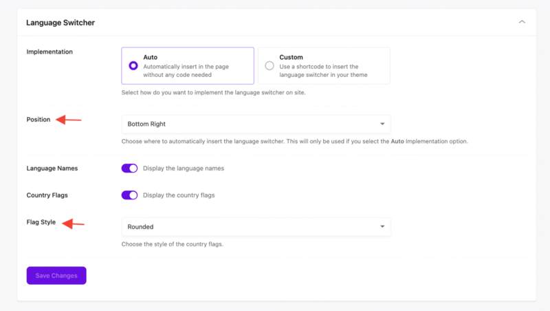
Choose Save Changes when you are done.
Language Names and Country Flags are independent toggles, so a flags-only or text-only switcher is a matter of turning one off.
Styling tab
Two sections, five settings each.
Trigger Styling is the closed switcher a visitor sees first:
| Setting | Type |
|---|---|
| Background | colour |
| Text Color | colour |
| Border Color | colour |
| Border Hover | colour, used when the pointer is over the switcher |
| Border Radius | 0 to 24px, default 6 |
Dropdown Styling is the open list:
| Setting | Type |
|---|---|
| Background | colour |
| Text Color | colour |
| Border Color | colour |
| Item Hover Background | colour, used on the language under the pointer |
| Border Radius | 0 to 24px, default 6 |
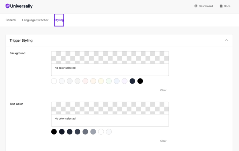
Each colour picker offers a palette of swatches and a Clear action to go back to no colour, which leaves the switcher's default in place.
Beyond the built-in options
The built-in switcher is a custom element that renders its own contents in a shadow root. That has one practical consequence: theme CSS cannot style the inside of it. A rule aimed at a class within the switcher matches nothing and fails silently.
Two things do reach it.
The element itself. universally-switcher is an ordinary element in your page, so your theme can position it:
universally-switcher {
  display: block;
  margin: 0 auto 1rem;
}
CSS variables. These are read by the switcher's own stylesheet and cross the shadow boundary, so setting them in your theme works. The four marked no setting have no equivalent in the Styling tab, and are the reason to use variables at all.
| Variable | Default | Also a setting |
|---|---|---|
--universally-font-size |
14px |
no setting |
--universally-trigger-padding |
8px 12px |
no setting |
--universally-trigger-bg |
#fff |
Background |
--universally-trigger-text |
#1a1a1a |
Text Color |
--universally-trigger-border |
#ddd |
Border Color |
--universally-trigger-border-hover |
#999 |
Border Hover |
--universally-trigger-radius |
6px |
Border Radius |
--universally-dropdown-bg |
#fff |
Background |
--universally-dropdown-text |
#1a1a1a |
Text Color |
--universally-dropdown-border |
#ddd |
Border Color |
--universally-dropdown-hover-bg |
#f5f5f5 |
Item Hover Background |
--universally-dropdown-radius |
6px |
Border Radius |
--universally-dropdown-shadow |
0 4px 12px rgba(0,0,0,0.1) |
no setting |
--universally-focus |
#0073aa |
no setting |
Set them on the element, or on :root to cover every instance:
universally-switcher {
  --universally-font-size: 16px;
  --universally-trigger-padding: 10px 14px;
  --universally-dropdown-shadow: none;
  --universally-focus: #7c3aed;
}
A value set in the Styling tab is written directly onto the element, so it beats the same variable declared in your stylesheet. Clear the setting if you want the CSS to take over. The two radius values are the exception: they are always written onto the element, so change those in the Styling tab rather than in CSS.
Build your own. If the switcher needs to be a row of tabs, a vertical list, or anything structurally different, render it yourself from the same data the plugin uses. See Build a custom language switcher in WordPress.